

Larry Rivers/Frank O’Hara - Stones
Stones is a collaborative print portfolio made by artist Larry Rivers and poet Frank O’Hara and published by ULAE (Universal Limited Art Editions) in 1959. The complete portfolio contains 13 lithographs (12 image prints and 1 title page).
Rivers and O’Hara were both prominent members of the New York School of Painters and Poets. This informal ensemble group encapsulated a high-water mark for the modernist creative forces working in mid-century New York City. Other prominent members included the poets John Asberry, Kenneth Koch, and James Schuyler. Visual artists in the group included Jane Freilicher, Fairfield Porter, Alfred Leslie, Grace Hartigan, and Michael Goldberg, among others.
Rivers and O’Hara met at a party in John Ashberry’s apartment in 1950, at the very dawn of this movement, and immediately became enmeshed in a bond that oscillated between deep friendship and a fiery intimate relationship. Tatyana Grossman founded ULAE in 1957, which would play a large role in the blossoming of the post-war Print Renaissance in America. It was here that print processes such as American lithography arts moved past their earlier mercantile uses for advertisements, posters and mass-market images for something more refined: art for art’s sake in the modern sense, made by master printers working with emerging artists to created small-run print series that were seen as complimentary to their other paintings, sculptures and drawings.
A central component of Grossman’s artistic vision was to create opportunities for collaboration between artists and writers. In 1957 she approached Rivers with such an idea, and he immediately suggested O’Hara as co-creator.
When ULAE published the Stones portfolio in 1959, it listed the production method as both ‘Tabloscript’ and ‘Lithography’, which is interesting. Lithography is obviously the physical matrix and method that the prints were created with. However, ‘Tabloscript’ was a term invented to describe the creative processes and impulses that informed the interactions used to develop the project as a whole. ULAE credited the coining of the term ‘Tabloscript’ to Barney Rosset.
Rosset was an important member of the New York literary world, and the founder of both the Grove Press and the Evergreen Review, and an early publisher of the Beat Poets. He was also a firebrand who made important contributions to publishing previously banned books, such as Lady Chatterley’s Lover and Tropic Of Cancer. ULAE defined Rosset’s Tabloscript beautifully thus: “Where the artist and the poet inspired by the same theme, draw and write on the same surface at the same time, fusing both arts to an inseparable unity.”
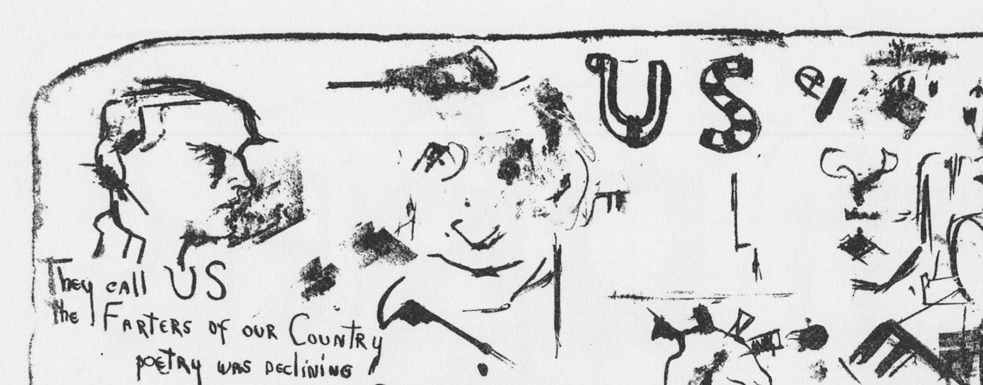
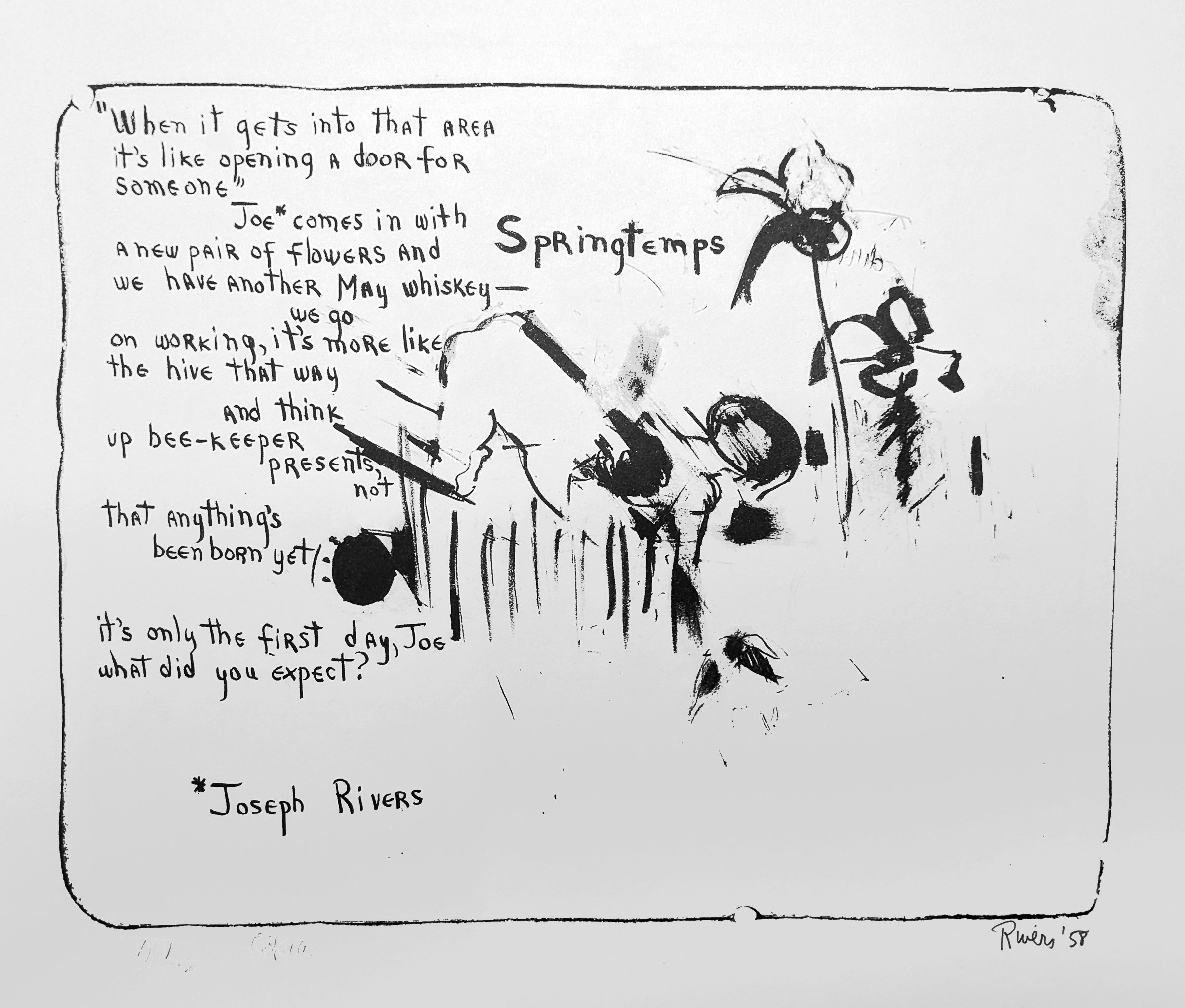
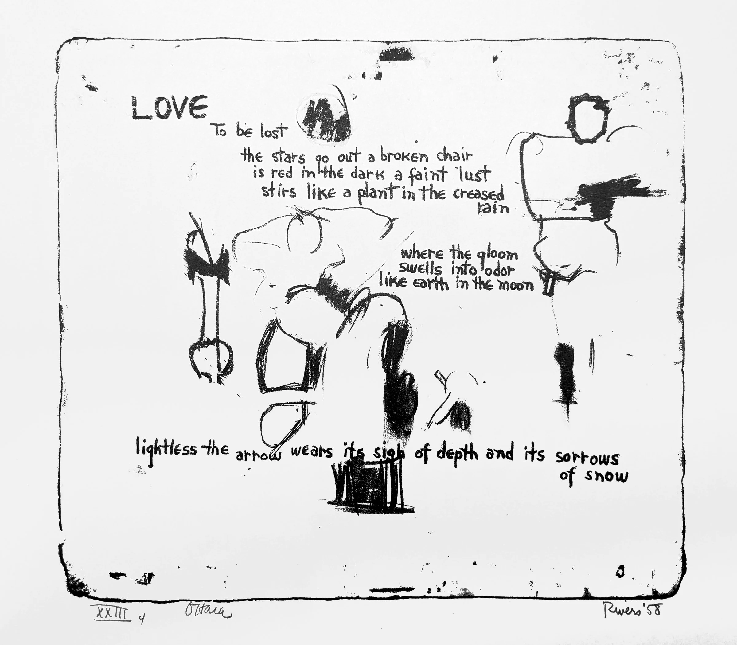
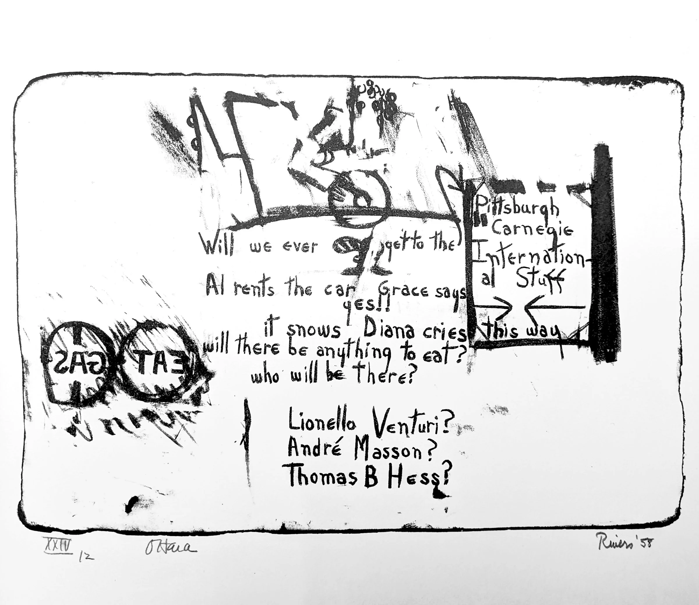
Indeed, the approach taken by Rivers and O’Hara was collaborative in real-time. One would never work on a lithographic stone if the other was not physically present to see what was happening. You could say that the process was the opposite of the ‘Exquisite Corpse’ tradition of Surrealist image-making, where one artist contributes to a drawing without being aware of what the previous artist or artists had already drawn on the page, the whole image’s various components and interactions only being revealed at the end when it was revealed as a singular image.
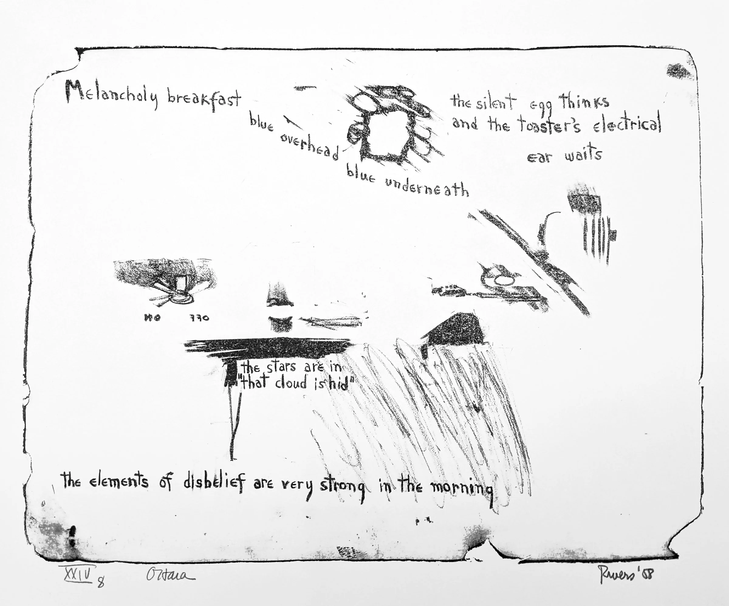
For each print, Rivers or O’Hara would create a small part of a portrait here, or a line of poetry there, to be followed by a mark or gesture there, a flowing thought fragment here. Word and image are truly part of the same thing, they do not sit beside one another, or illustrate each other. They inhabit the same space and moment in time, the way that Einstein merged space and time into the singular, relativistic ‘SpaceTime.”
What letters and lines do not touch remains blank space. Sometimes in art this is referred to as “negative space” or “neutral space”, leaning into the meaning of what is not part of an image but can be seen in conjunction with it. Stones is different. Here the non-marked areas are not Void, but atmosphere, they are the oxygen that lets the gestures and thoughts breathe. This is why each sheet employs a thin-lined rectangular border: inside the border everything is a snapshot of something that was vibrantly alive and summoning itself into existence. Outside the border is the void, a sheet of paper, a signature, a date. Facts, not fulfillment.
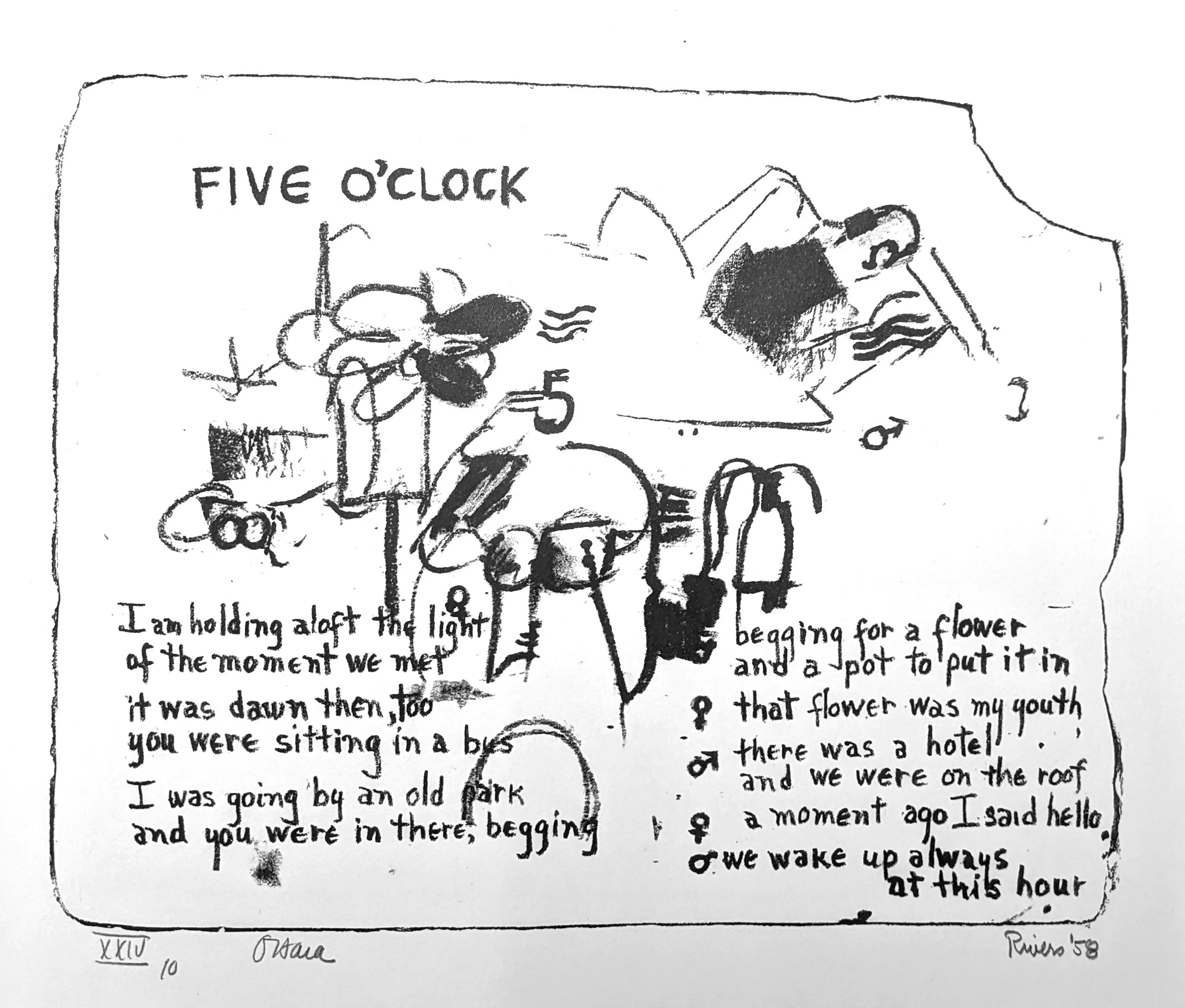
Inside the borders is a fishtank of moments: a quick portrait of O’Hara, a lament about the state of poetry, a part of a flower, “the end of all existences”, a darkened doorway. Faceless, cycladic figurines, “Love, to be lost, the stars go out a broken chair.” Energy, time, and sketch of an artist at work. Art making itself.
Stones is a beautiful example of how art and poetry can best be understood as parts of the same thing, both words and marks creating images and feelings in the mind through the contemplative participation of the viewer. It also perfectly captures my favorite period of American Art History: a brief moment between the beautiful existentialism of Abstract Expressionism and the superficial reality of Pop Art.
All images displayed for educational purposes only.
Additional Information:
Larry Rivers & Frank O’Hara
Stones, 1957-1959
Portolio of 12 lithographs and title page
19 x 23 1/4 in. / 48.3 x 59.1 cm. each
Edition of 25
Published by ULAE
The images for this article are sourced from the wonderful Stones catalogue published by Tibor de Nagy Gallery as part of that gallery’s 60th Anniversary. You can learn more about it on the Tibor de Nagy Gallery website.
You can also learn more about the portfolio from the website of the edition’s publisher ULAE on their website.

David Kramer - Drawings

David Kramer, I Will Take Style Over Substance…, 2019
This modern world has not turned out to be the gauzy utopia we were once promised, and David Kramer is here to tell us all about it. The paintings of David Kramer are full of self-deprecating humor, irony and witticisms that question the conceits of adulthood and the artist’s own place within it. Through a combination of text and image, Kramer melds nostalgia with disillusionment.

David Kramer, If Character Had Currency…, 2019

David Kramer, I Like To Think Of Myself…, 2019
A child of the 1970s, David Kramer pulls from that formative decade, re-crafting its lifestyle advertisements and distinctive interior design into paintings, drawings, and installations both nostalgic and ironic. His compositions resemble the advertisements that, as he claims (with the tongue-in-cheek humor that shapes his output), modeled his future: “I felt certain that my future would look a lot like what I was looking at in those ads. […] I am still hoping to grow up and get my hands on those things.”
Text is central to Kramer’s work. He overlays what he calls his “one-liners” onto his images, revealing the falsity of the idealized vision they present and the disillusionment of adulthood. In Plan (2011), the phrase, “In case of emergency…plan B and C,” frames a still life of whiskey and cigarettes, motifs that appear in many of his works.


David Kramer, When I Told You…, 2019
In 2019, Owen James Gallery published 2 prints with David Kramer. Although the artist is primarily known as a painter, the prints highlighted the draftsman qualities of his prolific drawings, with the added feature of unique hand-coloring of the letters by him.

David Kramer, Clown, 2019, Lithograph with hand-coloring, Edition of 35.
Published by Owen James Gallery, NY
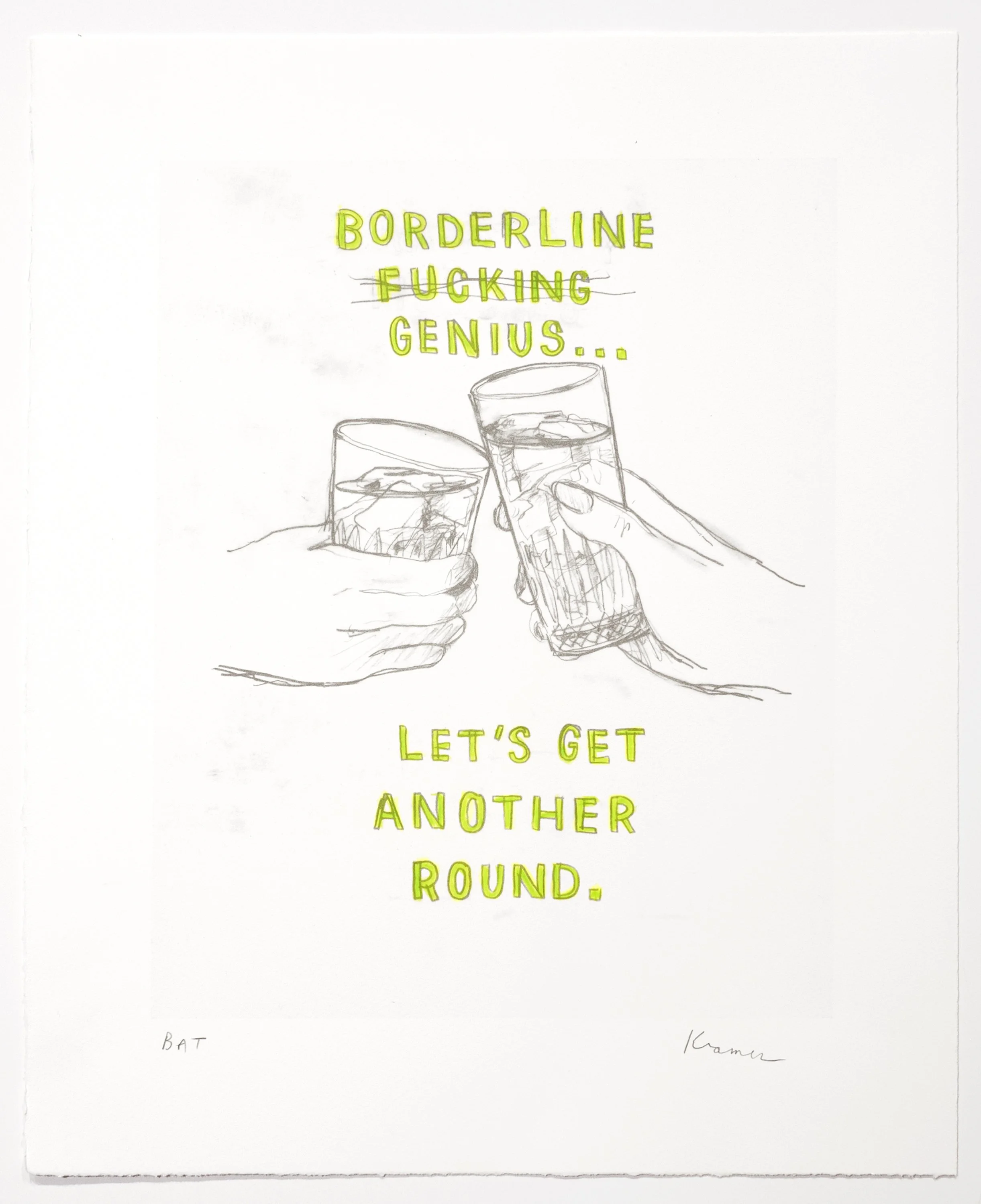
David Kramer, Borderline Genius, 2019, Lithograph with hand-coloring, Edition of 25
Published by Owen James Gallery, NY
Also in 2019, the indie-publisher Little Big Time Press released a small-format book highlighting a selection of David Kramer’s drawings on paper, some of which are shown here. The book can be purchased on the website of Little Big Time Press.

David Kramer: Better In The Future, 2019
Published by Little Big Time Press
All artworks are © David Kramer. Images and texts are sourced from Owen James Gallery and Little Big Time Press.

Dina Gadia Collages

Dina Gadia is a mixed media artist who subverts the artifice often found in the commercial and popular culture influences in her native Philippines. Through her reuse of vintage material, Gadia reveals the inherent antagonism and prejudices applied to elements of taste, cultural imperialism, sexuality and nationalism.

Dina Gadia, Aestheticized Arrangement, 2015
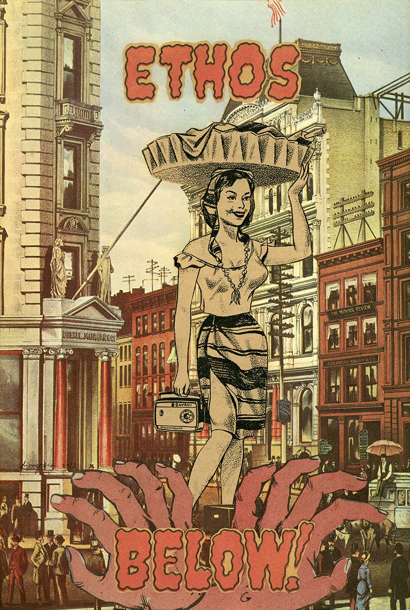
Collage holds a special place in Gadia’s creative output. Trained as a graphic designer, she selects and reassembles typography, figures, and images from varied sources such as comic books, outmoded advertisements, entertainment magazines and pornographic material. The sources of her working materials are both local Filipino as well as imported American pop culture fare.
(image: Dina Gadia, Customs to Launder in a Doppelganger Habitat, 2013)

Dina Gadia, Devils of the Deep, 2015
The amalgam of indigenous and foreign cultures in the Philippines can be seen especially in the artist’s use of language. The dramatic words cut out from comic book pages adds a colorful commentary, creating surreal associations and icons that foster a unique visual identity. Alternating between English and Tagalog words and phrases, Gadia adds an often confrontational punch to her images. “Power”, “Witching Hour” and “Kislap Ng Pangil” (“A Glimmer of Fang”) play between their dramatic declarations and the ironic titles of the works themselves.
In another example, Gadia takes old covers from Liwayway Magazine (Dream Magazine), a long-running publication of serialized stories, comics and entertainment news. Here, photogenic cover models are transformed into monsters, as flames and snakes creep out of their eyes and mouth. These can be seen in different ways: as comments on accepted ideas of beauty, or condemnations of the superficial veneer of mass media publications that distract the public from the real ills of the society around them.

Dina Gadia, Liwayway (Flattering Portrait of '57), 2015

We also see in the work of Dina Gadia the reversal of sexual conceits: the female nude is often centralized and empowered, while male beefcakes are reduced to winsome decorations, or have their sexual prowess exaggerated to comical effect.
(image: Dina Gadia, Fear of Nice Things, 2015)

Dina Gadia, Unashamed Love Rites, 2015

Dina Gadia, Two Times Kitsch, 2015
All artwork ©Dina Gadia
Text and images sourced from her exhibition “Non-Mint Copy” at Owen James Gallery, NY.